It is this simple: Your patients have no means of evaluating the quality of the services you provide. They have not experienced a professional dental curriculum, and therefore are ill-equipped to evaluate occlusion, interproximal contacts, margins, contour, etc. Your patients must base their decisions regarding quality on other less tangible factors. They know rapidly if they like your staff, if they like you, if you and your staff like each other, or if friction exists within your team.
As stated in my foreword to the ADA publication, “A Guide to Building, Remodeling and Relocating,” a well-conceived dental office will have an immediate and positive impact on virtually all facets of your practice. Besides improving your productivity and decreasing your stress, your facility will allow you to create an “image” or “identity” for your practice consistent with the type of practice you currently enjoy or intend to develop. It will communicate the quality of your services and inspire your patients’ confidence. Make your office a reflection of your personality. If your patients are your raving fans, it follows they will rave about your new office.
|
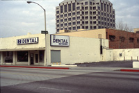
Figures 1 and 2. Which office better reflects the quality of your services?
|
 |
 |
| Figures 3. Make certain your community is aware of your project. |
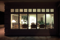
Figure 4. Marketing by leaving your lights on.
|
 |
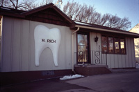
| Figures 5. Is dental anatomy the appropriate image for your practice? |
Although it is often difficult to admit, it is human nature to “judge a book by its cover.” The appearance of your building (whether freestanding or leasehold space) speaks volumes about your level of professionalism and quality of care. Architecture sends a strong message to the world. More often than not, potential patients make judgments regarding the quality of your services prior to entering your office. It has been said, “you have only one chance to make a good first impression.” Although most of us would not argue this point when it comes to grooming or a firm handshake, the first impression made by your office is all too often overlooked. Your facility is the physical representation of the quality of your services. Imagine the evaluation process a potential patient may make when seeking a dentist who will provide the finest care for them and their family. If you were new in town, seeking a dentist, which office would you choose (Figures 1 and 2)? Which office would you and your staff prefer to leave home for each day, proud to be a part of your practice? Which office will better attract prospective staff members?
If you are constructing your own building, consider the drive-by marketing impact of your facility during the 7 to 10 months of construction. Place a sign on your property alerting all passersby as to your new location (Figure 3). Interest from your community is a natural by-product of the activity of construction, of watching a building evolve over time. When you occupy your new office, don’t underestimate the value of “marketing by leaving your lights on.” You can very effectively promote your practice by allowing those who drive by your office after business hours to see the greeting and reception areas inside and discover how warm and welcoming it is (Figure 4).
| Figures 6 and 7. Create a consistent practice identity with signage that compliments the design of your office. |
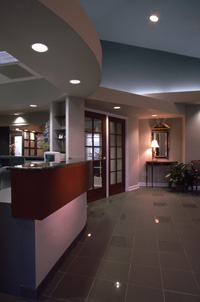
| Figures 8 and 9. Your prospective patients’ perception of the quality of your services is based on factors other than the actual quality of your dentistry. |
When your office is completed, also consider how you will identify your practice with signage. Once again, put yourself in your patients’ shoes. What image would you prefer your patients visualize when they think of your practice? As dentists, we are immersed in “dental anatomy” from the very beginning of our dental training. We meticulously study the three-dimensional configurations of every tooth, and its roots, inside and out. Does a molar, with roots attached, necessarily translate into the symbol patients perceive as most representative of your service quality (Figure 5)? Most often an extracted molar is a symbol of a dental failure, not a positive mental association. A sign that communicates your practice as a dental professional is most effective when planned in harmony with your building (Figures 6 and 7).
Whether you are developing a building, relocating your practice, or freshening up your current office, display your interior design “color board” in your existing reception room. A color board is a compilation of all the color-coordinated finish material samples to be used throughout your new office, again reflecting your personality and in keeping with your practice image. This will create interest among your patients of record as to the attractive state-of-the-art office you have planned for them, with a resulting increase in conversations between your patients and their acquaintances who may be seeking a dentist.
When developing a new image for your practice, keep it thematically consistent. The color scheme of your interior design can become the color scheme of your print materials, bringing a cohesiveness to your image. As with the building exterior, the interior layout and selection of lighting, finishes, furnishings, art, and accessories must reinforce your unique personality. It must be a place that supports how you wish to practice, with the flexibility to adapt to rapidly evolving technology. Perhaps you wish to balance the concept of “high tech” with that of “high touch”; maybe you seek to project a “spa” or “salon” atmosphere. All this must be communicated with your design professionals, so that your identity is reflected in every detail, inside and out.
Once past the threshold of your office, patients are greeted not only by staff, but by the personality of your practice as projected by the interior environment. The fact is, the walls do indeed talk to your patients. The question is, are they saying the right things?
It is very easy to become numb to the physical state of the interior and exterior of your office, often overlooking what patients (especially those new to your practice) see as a first impression. Be certain that the positive first impression established by the exterior of your office carries into your greeting area. Reinforce the fact that your patients have made the best choice when selecting your office (Figures 8 and 9).
The axiom “If it is not better than where you came from, why go?” holds true for both you and your patients. Successful dental office design not only facilitates successful construction, but creates an appropriate identity for your practice. The image of your practice is directly affected by the choices you make in exterior building design, room relationships, equipment, technology, lighting types, ceiling heights, color selection, finish materials, and all of the other details that communicate quality. Your professional image encourages patients to tell their friends about you, and keeps you and your staff enthusiastic, efficient, and productive. Creating a new environment and identity for your practice requires the assembly of a talented team of professionals to assist you in realizing all that your practice can become.
CONCLUSION
Creating a new office is the largest single investment you will make in your business. Allow adequate time to make the right decisions that will impact your practice positively for the rest of your practice life. From the onset of planning, be sure everything will function in the way you desire. If it does, you may never have to build again. If it doesn’t, your costly errors will haunt you continuously, affecting the efficiency of your practice and the morale of your entire office team.
As any business owner knows, “failure to plan is a plan to fail.” By carefully identifying your vision for your practice, selecting a team of qualified design professionals, and creating an office that expresses the quality of care you and your staff provide, the result will most certainly be a plan for success!
Dr. Unthank is a registered professional architect and dentist, and speaks both “languages” fluently. His experience and in-depth knowledge of these disciplines provides him with an empathetic understanding of what constitutes successful dental office design. Please visit Dr. Unthank’s website at www.unthank.com.
Ms. True is director of interior design for Unthank Design Group. Geri blends issues of aesthetics and ergonomics, environmental psychology, and product knowledge. She has been a contributor to publications in the dental and interior design fields, and has been recognized nationally for her involvement in the American Society of Interior Designers.


