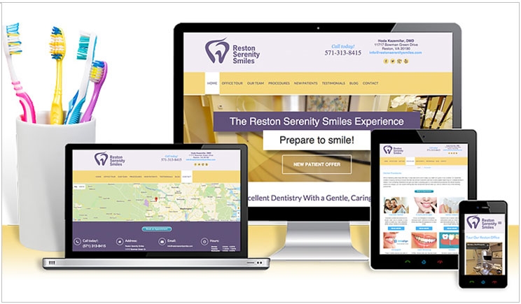
Many of your patients and potential patients are part of today’s agile, mobile, tech-savvy Internet generation. The mobile devices that are an integral part of their daily lives have already outpaced their more cumbersome predecessor, the desktop computer.
Smartphones and tablets are the wave of both the present and the future. Your patients can access information with a single swipe. Your dental website, then, must be designed in a user-friendly manner to accommodate these new technologies and be responsive to this new information paradigm.
Responsive Websites
If you have one website designed for desktop viewing and a second website designed for mobile access, it may be time to get a single responsive website. If you’re not sure if your website is responsive, you can use this helpful tool to find out.
Responsive websites focus on simplicity, using tools that enable visitors to access them across all platforms, including tablets, cell phones, and older desktops and laptops. Their flexible design enables their layouts to change, depending upon which device someone is using to access them.
Say I’m a potential patient. My neighbor is a longtime patient of yours and told me about you and your wonderful staff. But it’s after hours, so I can’t call your office. I want to know, then, if your website explains the advantages of an implant over a traditional crown.
So I go to your website, which was designed for desktops and laptops, on my smartphone. Although your site provides the information I need, complete with illustrations and pictures that clearly explain those advantages, its older design is too big for my phone’s screen, and I can’t easily view it.
Frustrated, I click off and search for dental implants near me on Google. Since Google prefers responsive websites, it will suggest several other practices that have them. Now, I will find the same information on your competitors’ sites, and you have lost the advantage.
What to Do
To remain relevant in today’s highly competitive market, your website must meet several criteria. It must be a single, all-inclusive site. It must be “Google friendly” with a responsive, adaptive design for all platforms. Most importantly, it must provide the best user experience for all of your patients.
Although it will take time to initially configure your responsive website, after implementation, changes will only need to be made on a single site, saving you both time and money in the long run.
If your website isn’t responsive, you need to make a change. If you don’t have the time or knowledge to do update it yourself, dental marketing professionals are available to help. Call them today for a more profitable tomorrow.
With over a decade of experience in corporate dental laboratory marketing and brand development, Jackie Ulasewich decided to take her passion for the dental business and marketing to the next level by founding My Dental Agency. Since starting her company, she and her team have helped a wide variety of practices all over the nation focus their message, reach their target patients, and grow their practice through effective marketing campaigns. When she isn’t helping dental practices reach their full potential, she can be found at the beach with her three dogs or immersed in everything food-related with her large Italian family. For more information, call (800) 689-6434.
Related Articles
Five Signs You Should Invest in Digital Marketing
Your Practice’s Website Needs to Grab Short Attention Spans
Encourage Online Reviews for Better Business


